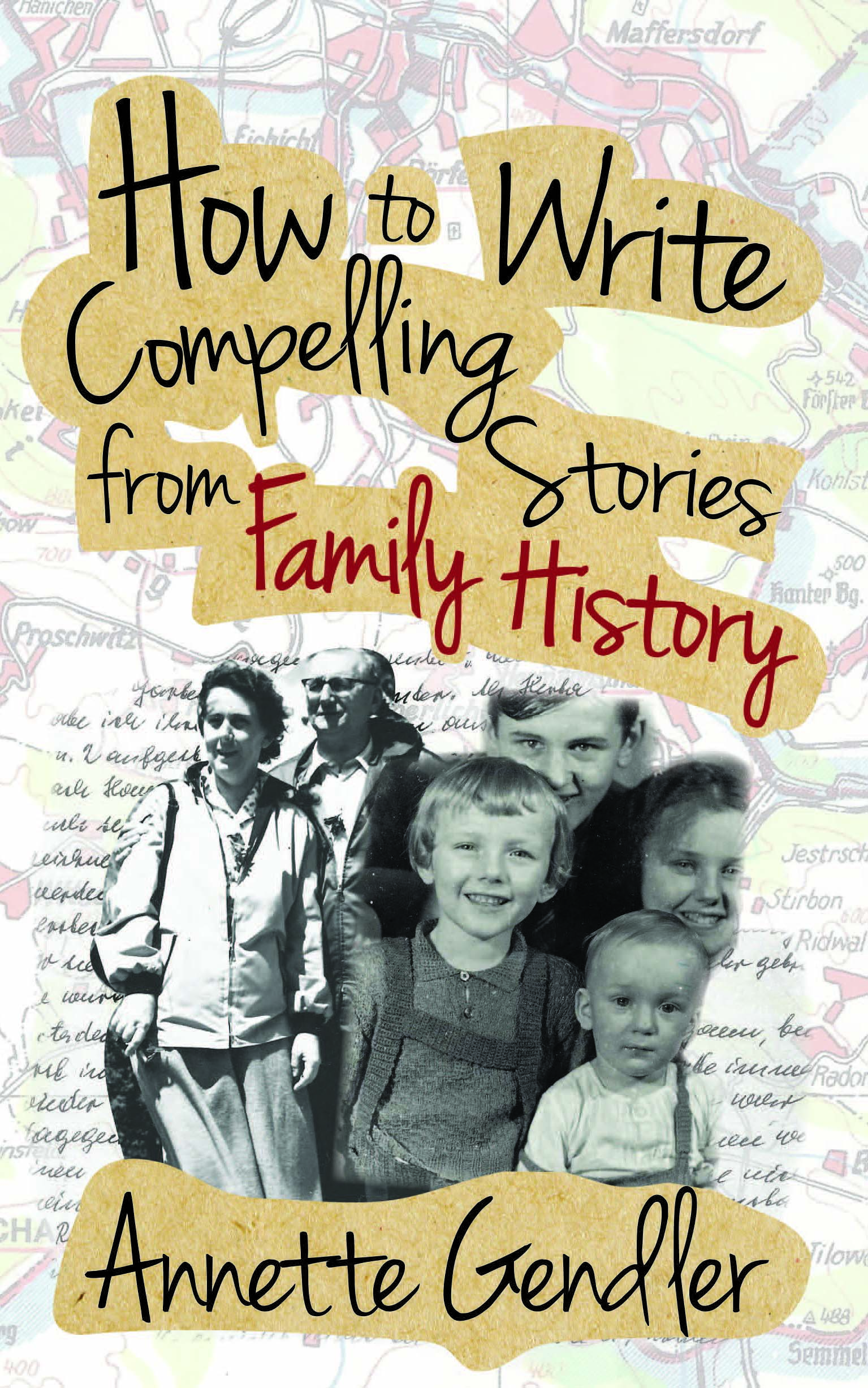
Last week, after two months of much back and forth with my book production team at Inspire Books, I finally signed off on the cover of my forthcoming book How to Write Compelling Stories from Family History. I wanted to share the story of how this cover came about right away but alas, I was simply too exhausted to put that together because I was also dealing with multiple revisions to the interior pages.
I still can’t believe how much work it was to arrive at a cover that would work for the genre!
A cover that I was happy with, that didn’t send my art director brother into a designer tizzy, and a cover that also adequately conveyed what the book is about. Phew! Truth be told, about a month ago I almost signed off on an entirely different version that had begun with the idea of using one of the illustrations in the book as the main cover image:
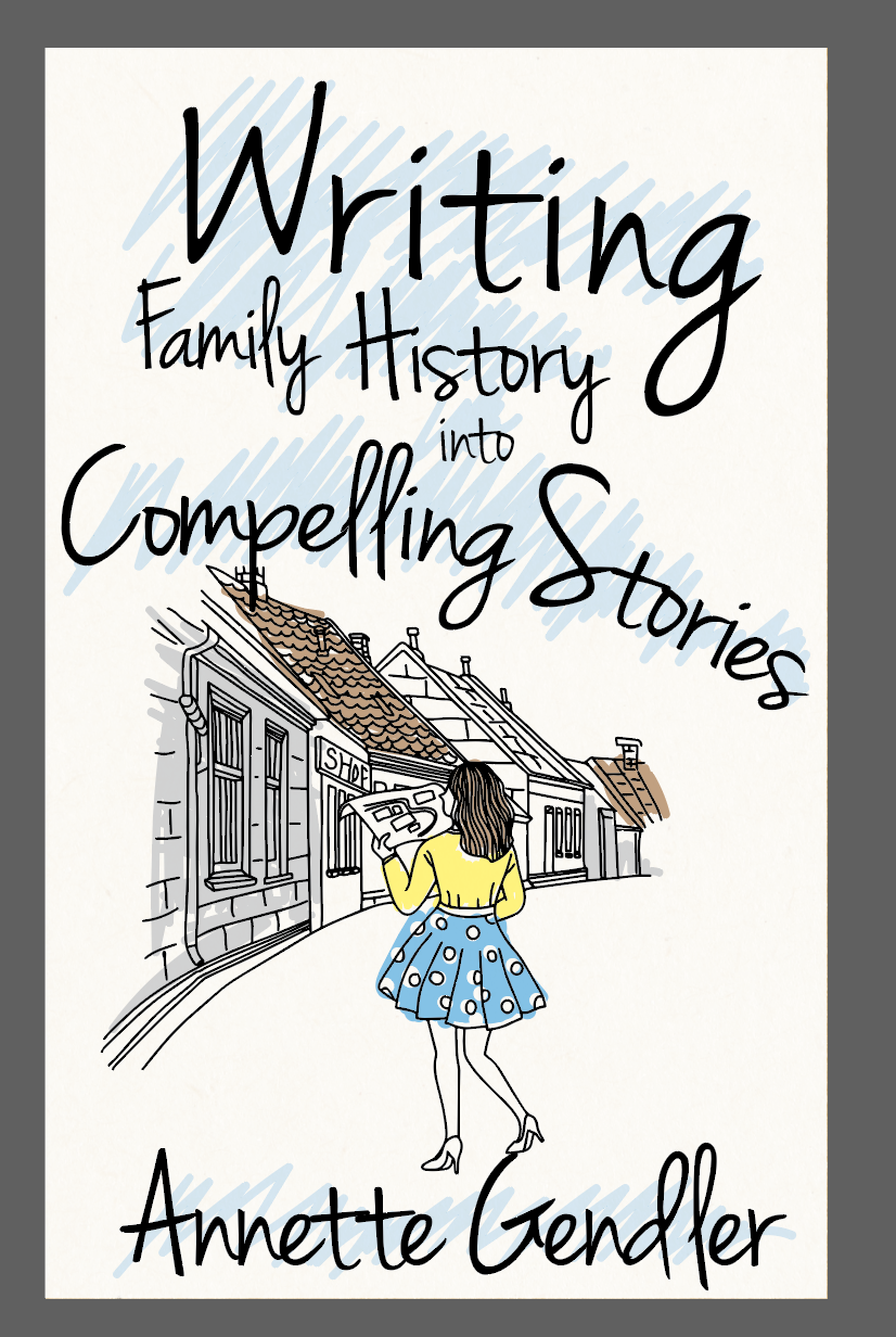
This was our first cover concept! While I wasn’t wild about the colors, I simply loved the space this illustration created, with the historical houses in the background, the vanishing point off to the right, and the woman who added a bit of a dynamic. Then my brother, who’s a graphic designer and specializes in typography, chimed in that if we were to use a handwriting font, it should be a handwriting with meaning. He started scribbling around trying to mimic my handwriting, and trying a few brushstrokes of his own.
One Sunday evening found us collaborating via WhatsApp, with him sending me images of his scribbles, and me printing and cutting them out to assemble a collage of a cover concept:
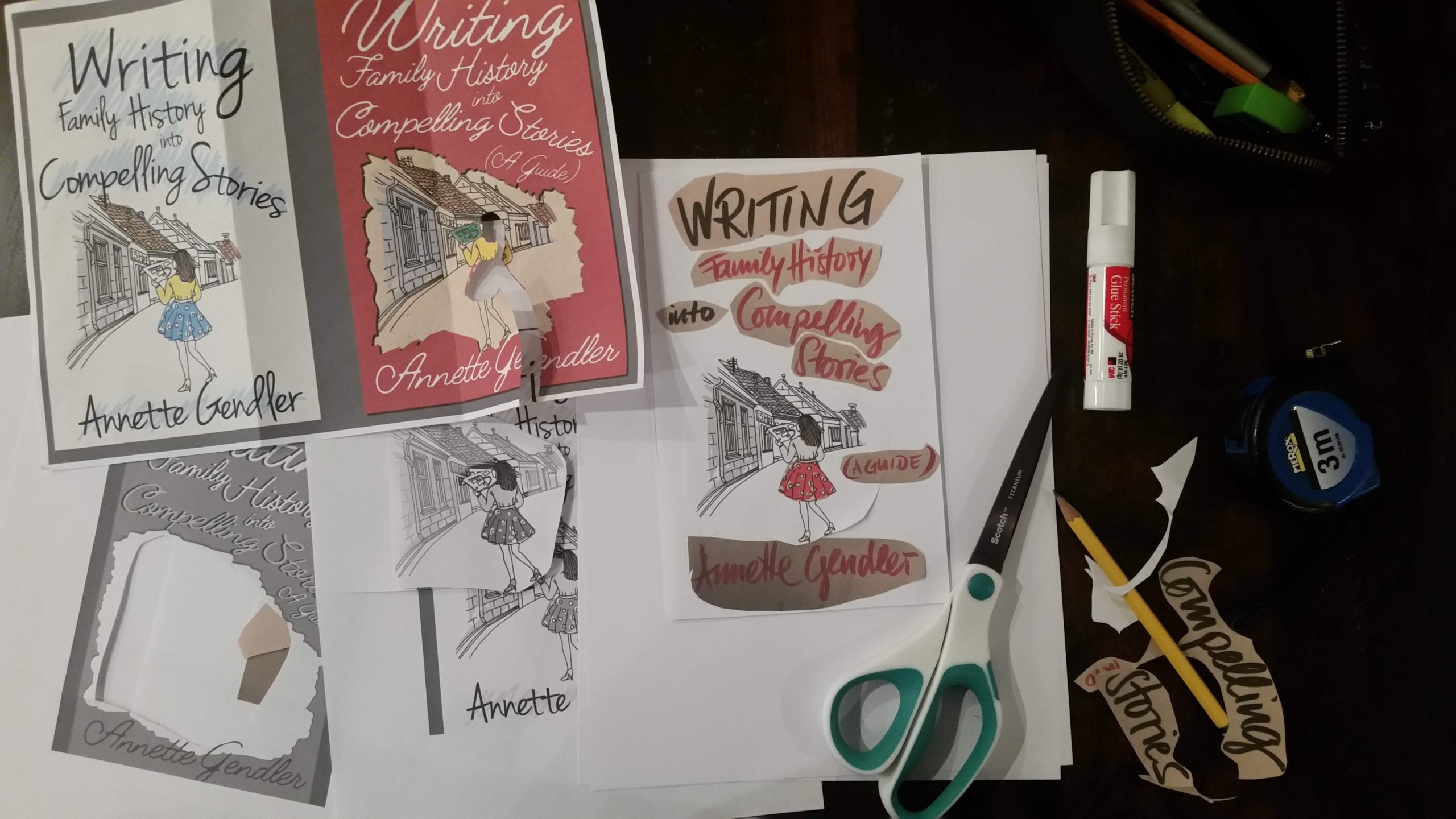
As I printed the images with my brother’s handwriting, what should have been whitish background came out looking yellowed. Initially I thought this was simply a nuisance but it turned out to be an idea we retained all the way to the final cover: to have the title appear on what looked like cutouts of yellowed paper.
I felt a title that looked like it was cut out from old paper spoke to the idea of working with family history, when you’re often dealing with yellowed documents, trying to piece something together.
Here’s the cover I almost went with:
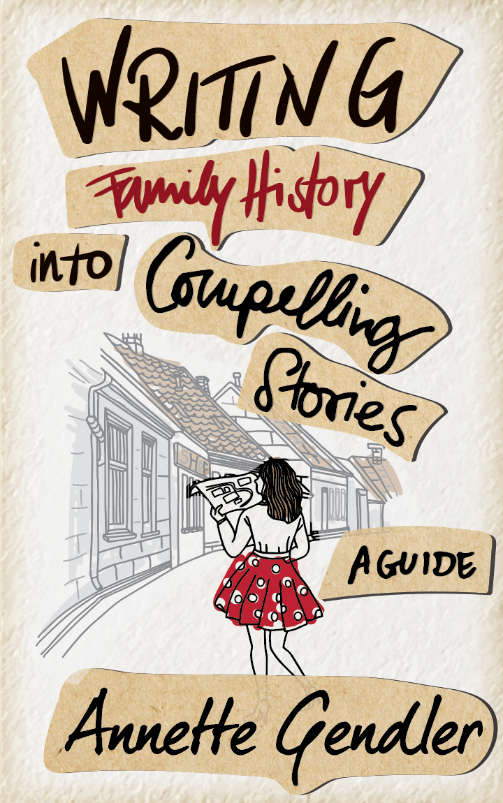
Before I signed off on this, however, I asked my family for their input. My older son got me worried when he remarked that perhaps “Family History” was hard to read and I should run this by a bunch of people who didn’t know anything about my work. So I did. I posted it to a Facebook group of savvy self-published authors. Next thing I knew they agreed that “Family History” was hard to read–and you can’t have a cover that is hard to read! But more importantly, the vast majority took this for a chic-lit book!
This cover, it turned out, was signalling the wrong genre!
I got the consistent feedback that a book about family history needed to have old family photos on the cover. The very thing I initially didn’t want! I can’t stand sepia colored photos on book covers! However, I needed a cover that would attract the right kind of readers who were interested in this subject. So old family photos it had to be.
I pulled some of my family photos I had used in Jumping Over Shadows, as they were black and white (not sepia!), and they were already scanned and good quality. So if you have read Jumping Over Shadows, these images will look familiar:
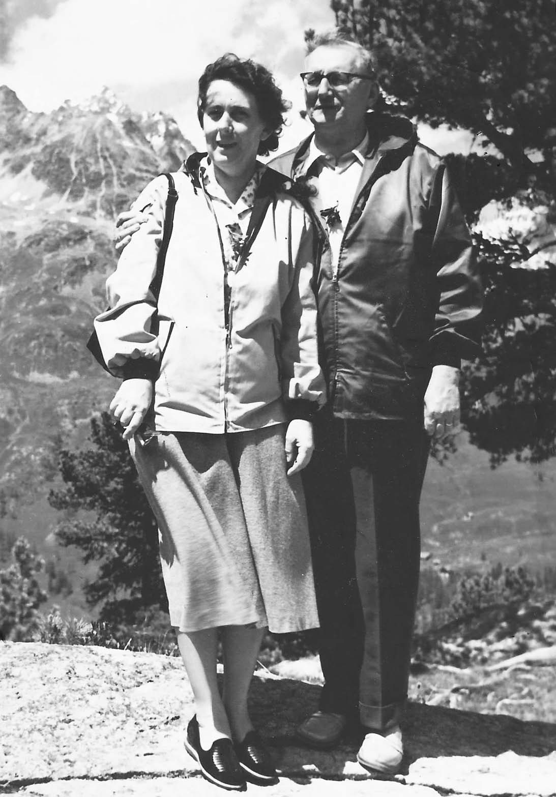
My grandparents, Hanne and Emil Karl Berndt, in the Alps somewhere, 1958
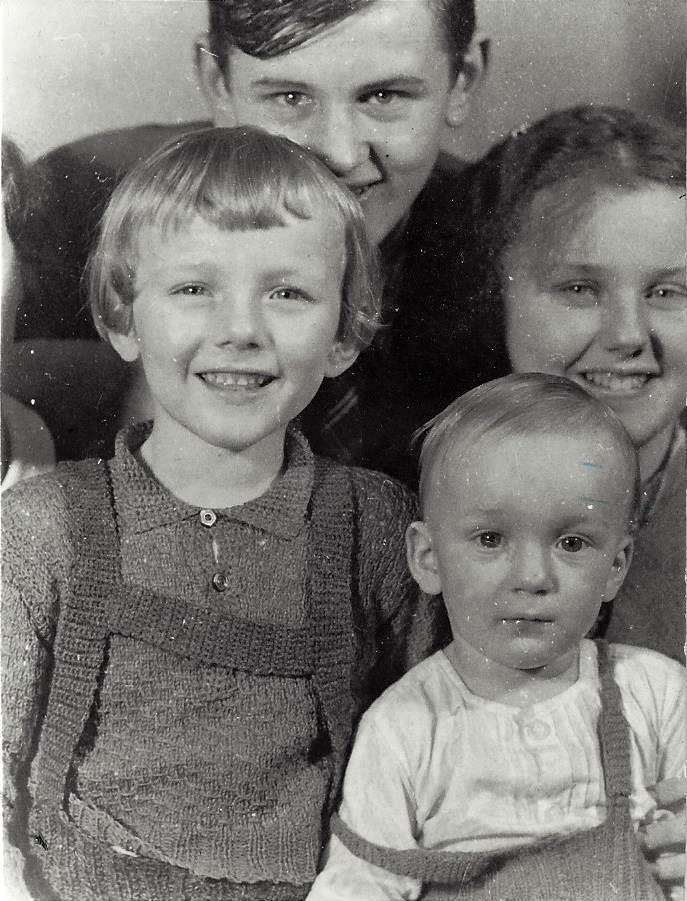
My dad (lower left) Helmut, with his brother Klaus next to him (Klaus sadly died of diphteria at age 7 in 1943), and his cousins Ludwig and Herta in the background, Reichenberg, Czechoslovakia, 1937
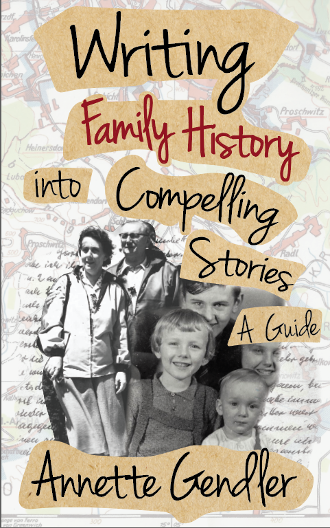
I also sent the designer some other materials, like a scan of my grandmother’s handwriting, and an old Bohemian map. These were all documents I owned and had at the ready. In the end, they all landed on the cover. So did my yellowed cutout idea as well as the font used in the very first cover concept.
Each iteration of the cover contributed to the end product.
One last-minute change, you won’t believe it! – was to the title. Through my rounds of beta readers (thank God for them!) I got one too many complaints about the title. Clearly, something didn’t sit right. Furthermore, when I presented this version to another Facebook group, many didn’t like the placement of “A Guide.”
My final proof reader offered the solution. You can’t write something into something, she said. And so we switched the title around to read:
How to Write Compelling Stories from Family History
It’s a bit of a mouthful, but beginning with “how to” clarifies what kind of book it is. And genre clarification was definitely one of my battles here! Adding the “how to” also got rid of the need to add “A Guide” somewhere.
I’m still getting used to the new title. However, the title isn’t about me, nor is the cover. Their job is to convey the book’s message to a potential reader, to pique his or her interest. Let’s hope this final cover does that!
Final Cover!
Curious about the inside? Click here to download the first few pages and take a look.
PS: I just uploaded the print-ready files to the KDP platform. If all goes well, I will be able to publish How to Write Compelling Stories from Family History this coming Tuesday, December 3. Stay tuned!
This was so interesting. I’m sure many readers and writers have no idea what goes into a cover design. I love the final result!
Thank you so much, Nancy! It was definitely a lot of hard work and back and forth to get this cover right.
I like the finished cover.
Glad to hear that!
Congratulations, Annette, on this new endeavor! Best wishes!
Thank you so much!