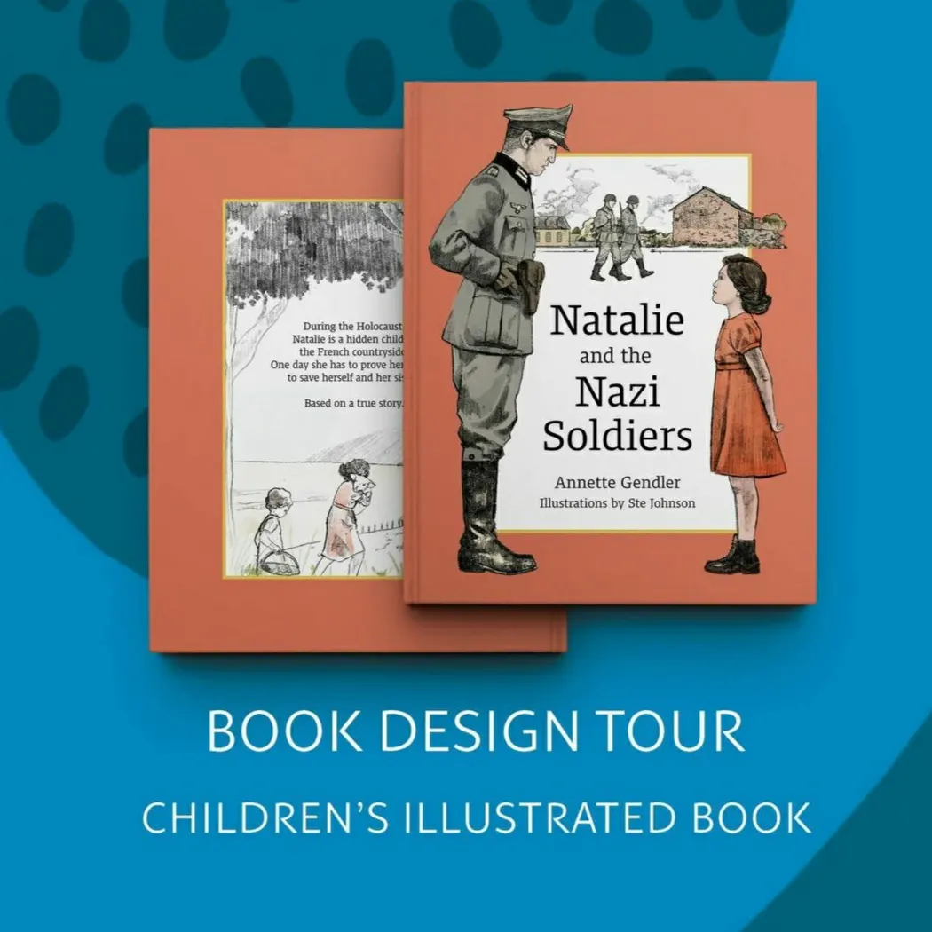
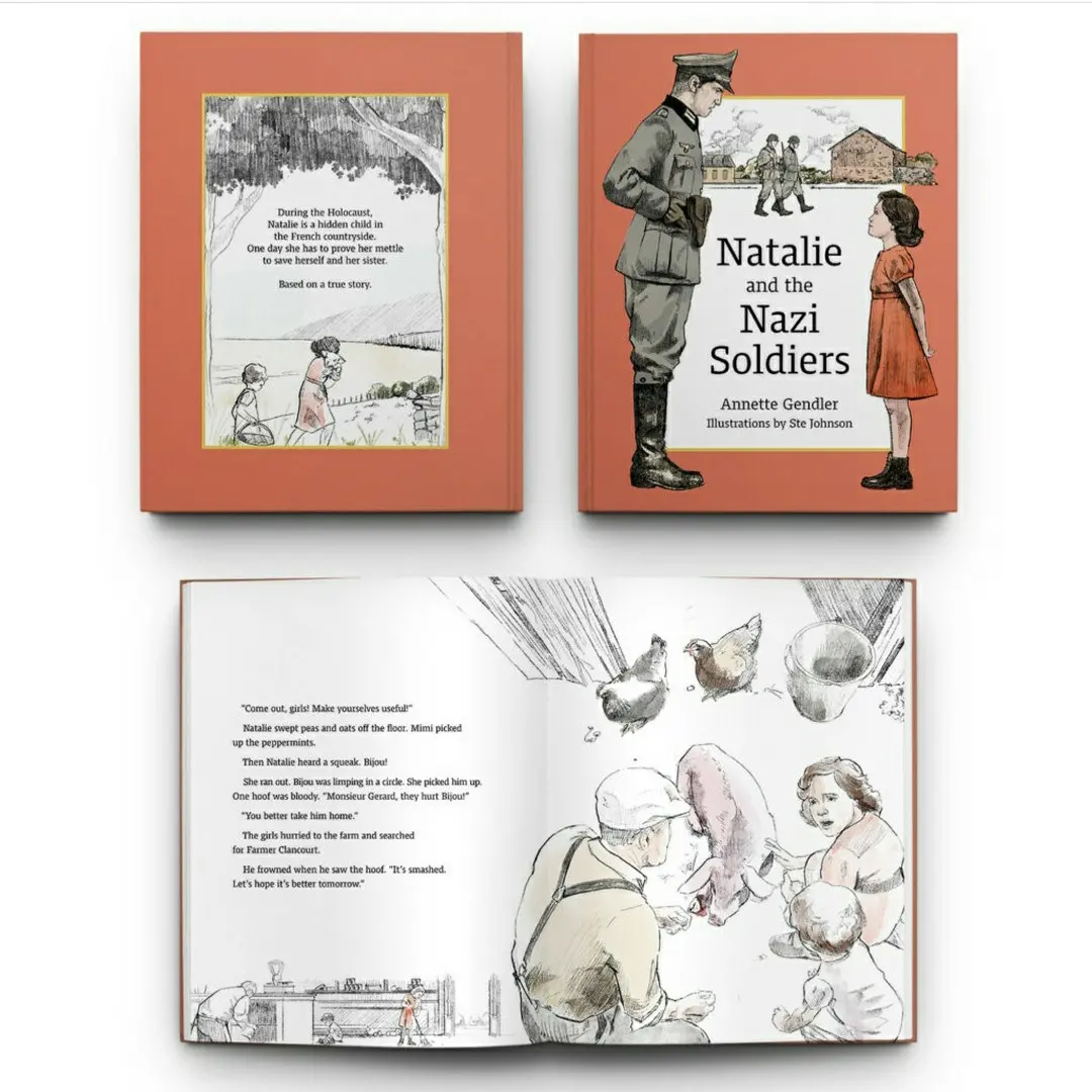
On her Instagram account, my wonderful book designer Melinda Martin put together this short tour of how we did the book design for Natalie and the Nazi Soldiers. This deserves a blog post, particularly here, where readers might look for a glimpse behind the scenes of this children’s book. So here goes:
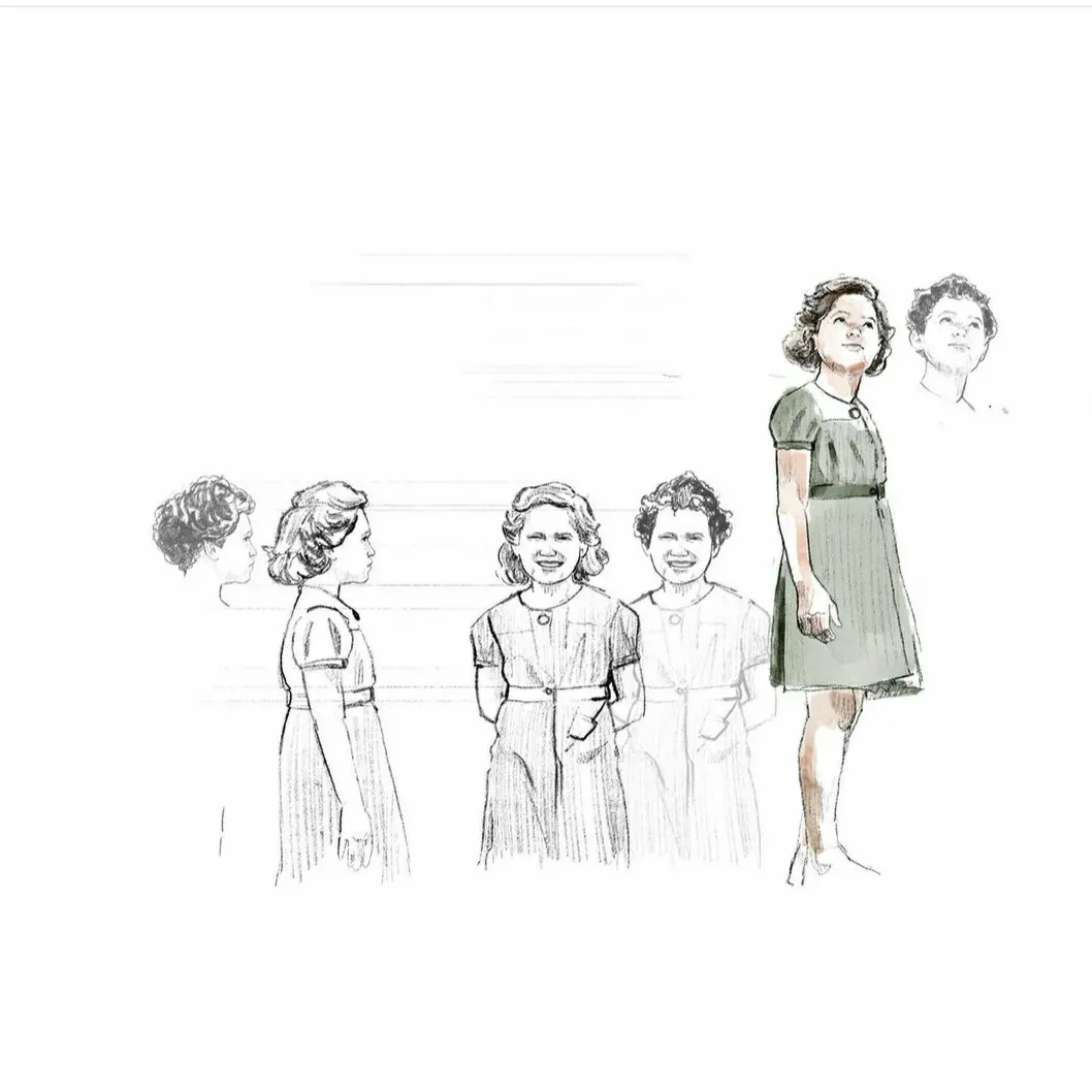
First came the character development, particularly that of Natalie, the protagonist.
To create this character, my talented illustrator Ste Johnson did a few sketches. Finding the right illustrator for this book had been a major hang-up for me. The photo below was Ste’s jumping off point. Taken in 1946, it is the only one I have of my mother-in-law, on whom Natalie is based, close to the time that she was hidden. For obvious reasons, there are no pictures of her and the entire family during the war when they were in hiding.
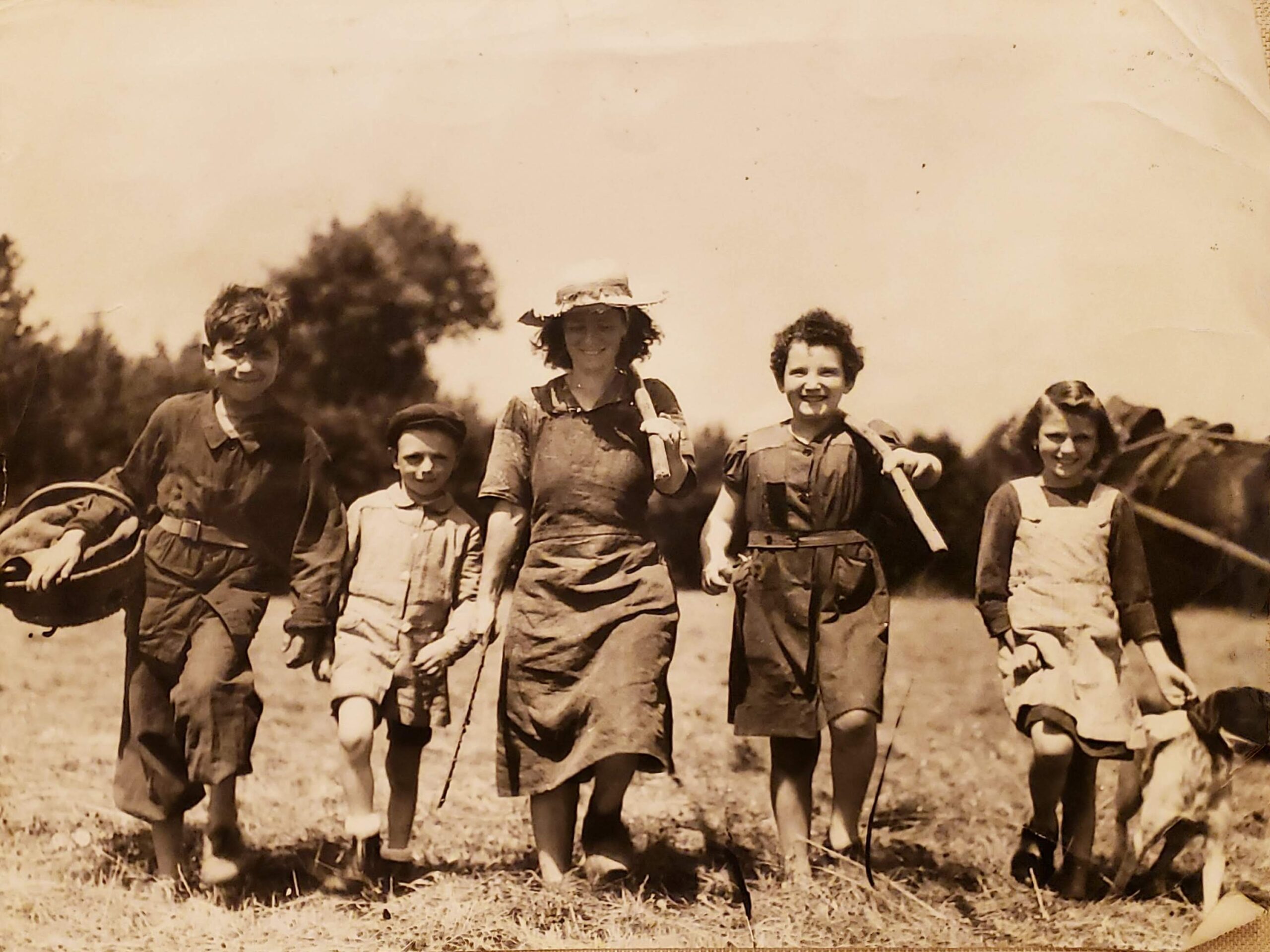
My mother-in-law Natalie (second from right) at age ten in 1946 in the French countryside. We don’t know who the other people in the picture are.
Initially, Ste drew Natalie with short hair, as you can see in the above sketches of her head to the left and in the upper right.
Indeed, Natalie had short hair, most likely because hers was quite curly and easier to deal with when short. They mainly used the village pond to wash themselves, after all. Lice, etc., might also have been a problem living under a barn.
A problem for us, designing the character, was that in black and white illustrations, Natalie looked like a Black girl with an Afro. This would not work for a character, who is an 8-year-old Jewish girl, particularly in the primary market of the U.S. So we ended settling on a short wavy bob for her, a hairdo popular for girls in the 1940s.
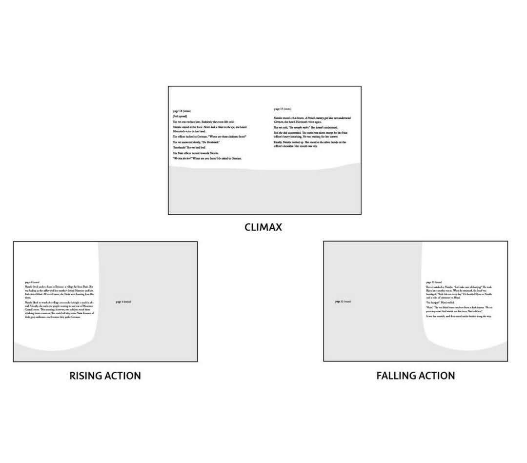
Meanwhile, Melinda laid out where the illustrations would be situated on the spreads. Illustrated children’s books are thought of in “spreads,” i.e. the two pages you view together when you open a book.
Planning the layout of the pages, Melinda brought her expertise into play, setting up the illustrations in a visual arc to dovetail with the narrative arc.
When reading Natalie and the Nazi Soldiers, you’ll notice (now that I pointed it out…) that in the beginning spreads, the illustrations are on the right page. For the climax, namely the high tension scenes, they take the whole spread. Then, as we move towards the end of the book, the illustrations switch to the left. Genius, eh?
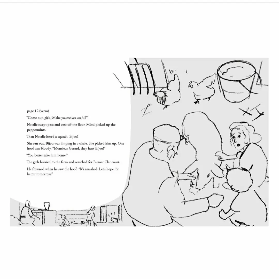
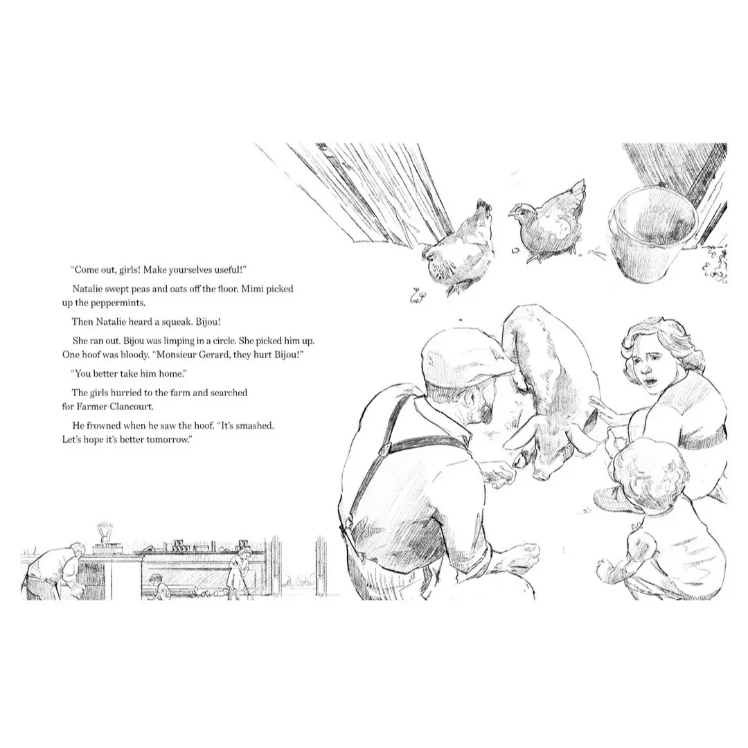
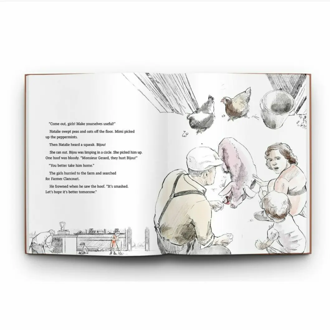
Next, Ste drew sketches for each spread. Once Melinda and I had to approve those, he moved on to finely illustrate each spread. Here you can see the development of the barnyard scene.
This is actually my favorite illustration in the whole book. And you know what?
Chickens are not mentioned anywhere in the text! That’s entirely the imagination of a good illustrator at work!
Needless to say, I thoroughly enjoyed experiencing the expertise, professionalism, ideas and imagination that Melinda and Ste brought to my children’s book project. I knew the book would become the best it could be if I brought in the right talent. That took some time, but I am so glad I did.
The cover design became a separate process once we had sketches of all the scenes. I will share that process in an upcoming post. Stay tuned!

Fascinating, Annette, thanks for sharing
Thanks!
Bravo!